
25 Modern Minimalist Kitchen Remodel with White and Gray
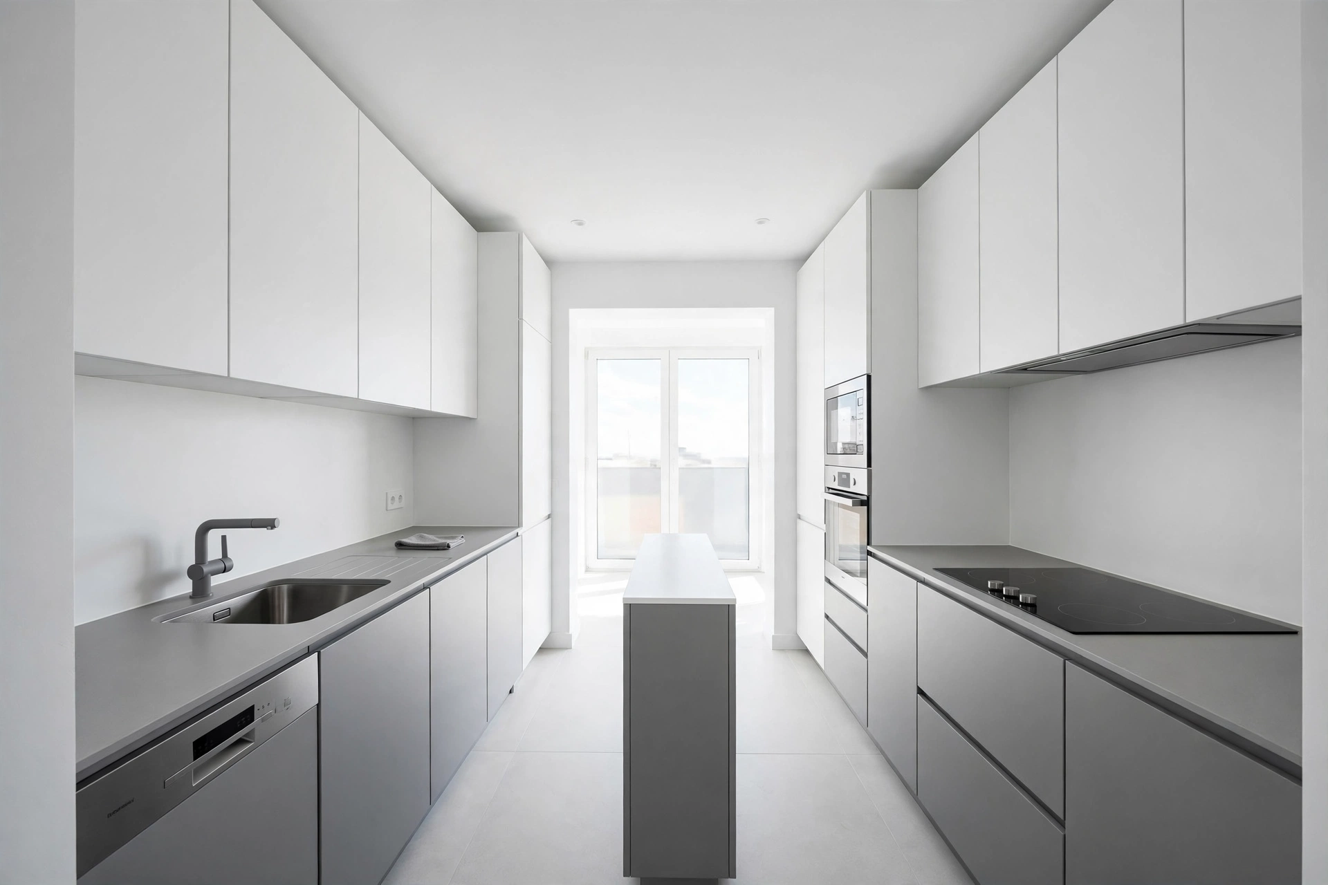
A modern minimalist kitchen remodel with white and gray is made for homeowners who love a calm, uncluttered home and want a kitchen that feels bright, spacious, and effortlessly timeless. With flat-panel cabinets, soft gray tones, and crisp white surfaces, this style turns daily cooking into a simpler, more peaceful ritual.
The secret is restraint: fewer visual breaks, hidden storage, and a tight two-colour palette that lets light do the decorating. If you love the warmth of timber instead, explore Modern Kitchen Remodel with Warm Wood Cabinets, and for a bolder, moodier take, see Modern Dark Kitchen Remodel with Dramatic Luxury Finishes. The twenty-five ideas below will help you plan a white-and-gray remodel that stays beautiful for years.
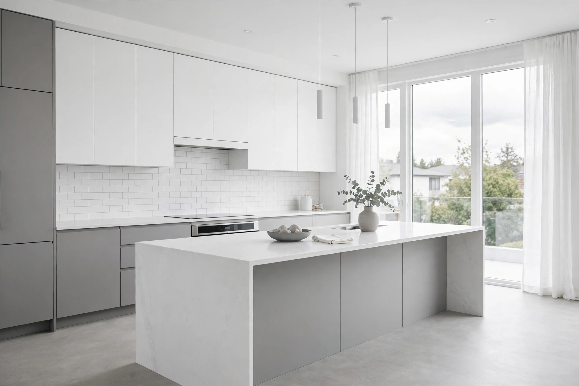
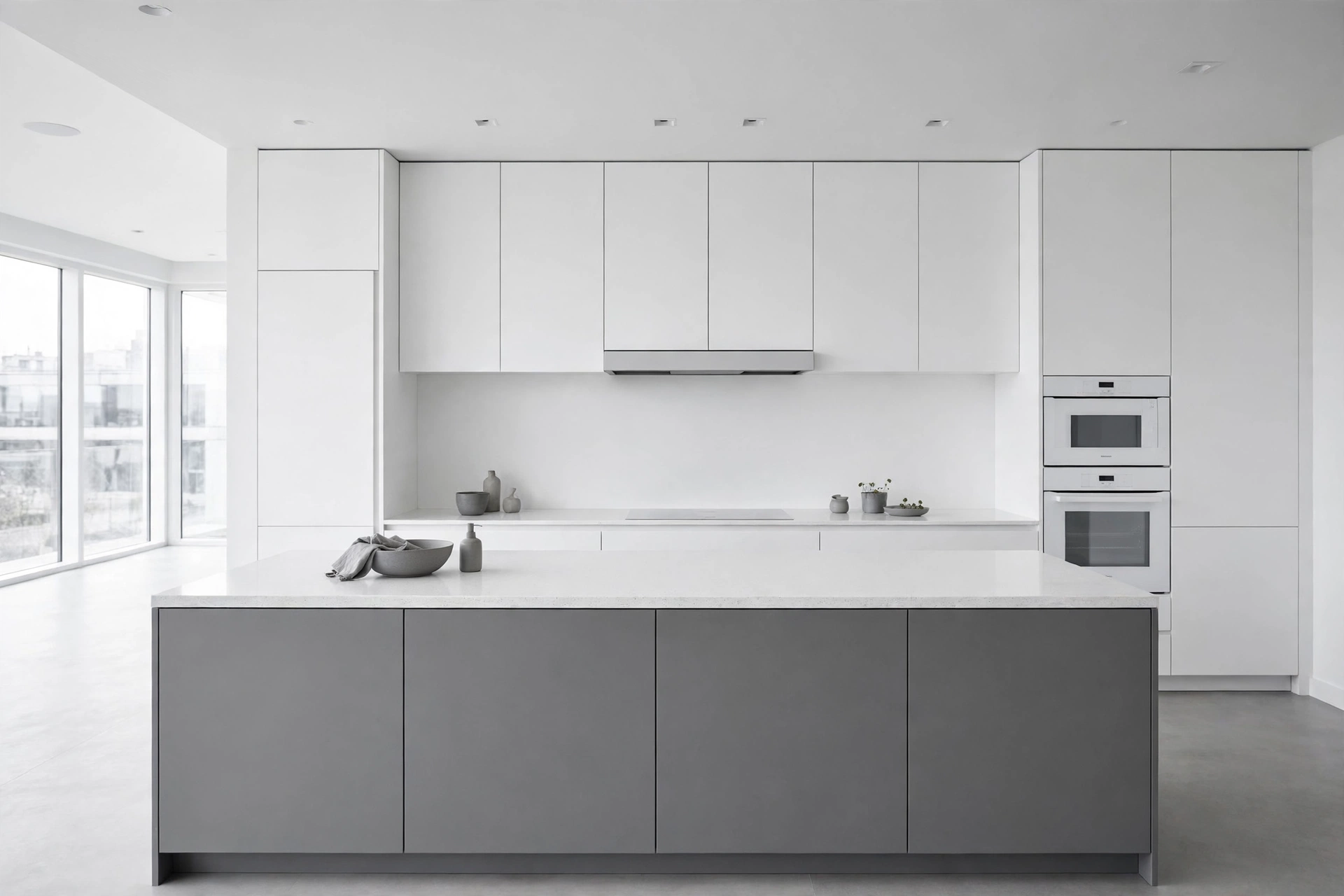
1. Flat-Panel White Cabinets Anchor a Modern Minimalist Kitchen Remodel with White and Gray
Flat-panel white cabinets are the foundation of this look, because their smooth, frameless fronts remove every visual interruption from the walls. Choose matte or satin lacquer rather than high gloss, since matte finishes hide fingerprints and soften glare in a sunlit kitchen.
Keep the uppers in pure white and run them to the ceiling, leaving no dusty gap above the cabinets. A common mistake is stopping cabinets at eight feet in a nine-foot room, which breaks the clean vertical line, so always fill the full height.
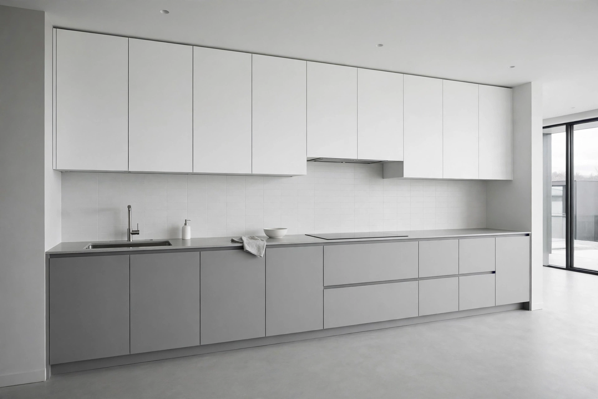
2. Handleless Gray Lower Cabinets for a Seamless Base
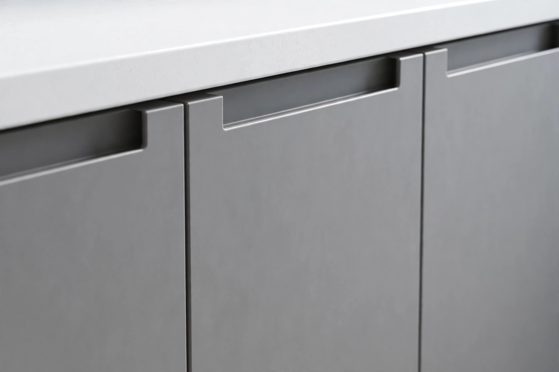
Handleless gray lower cabinets give the base of the kitchen a quiet, furniture-like calm, with no knobs or bars to catch the eye. A recessed finger pull routed into the top edge of each drawer front, about one inch deep, keeps the fronts perfectly flat.
Pick a mid-tone warm gray rather than a cold blue-gray, so the base feels grounded instead of icy against white uppers. Avoid mixing two different grays on adjacent drawer fronts, since even a small mismatch reads as a mistake in a minimalist room.
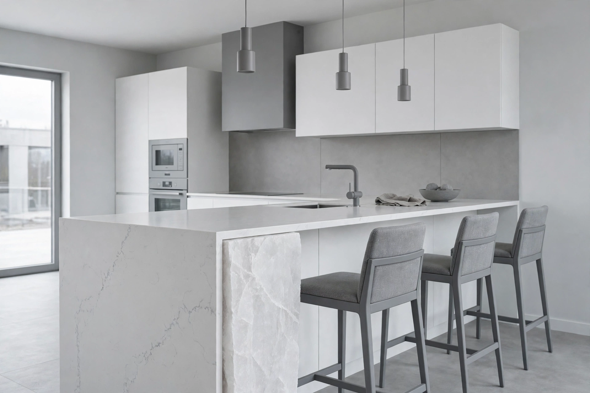
3. A White Quartz Waterfall Island as the Centrepiece
A white quartz waterfall island, where the countertop material drops vertically down both ends, instantly reads as luxury without any ornament. Use a slab at least two centimetres thick with a mitred edge, so the waterfall joint looks like one continuous piece of stone.
Keep the island at least 42 inches from surrounding counters so two people can pass comfortably behind a cook. The mistake to avoid is choosing a heavily veined quartz, which fights the minimalist calm; a soft, faint veining pattern works far better here.
4. Panel-Ready Appliances Hidden Behind Flat Fronts
Panel-ready appliances disappear behind matching cabinet fronts, so the refrigerator and dishwasher never interrupt the wall of white and gray. Order the panels from the same cabinet maker, in the same lacquer batch, to guarantee an exact colour match.
Leave a two-millimetre shadow gap around each appliance panel rather than a tight butt joint, so doors swing freely without rubbing. Never mix stainless and panel-ready appliances on the same wall, since the mixed finishes destroy the seamless effect.
5. Restrained Open Shelving, Used Sparingly
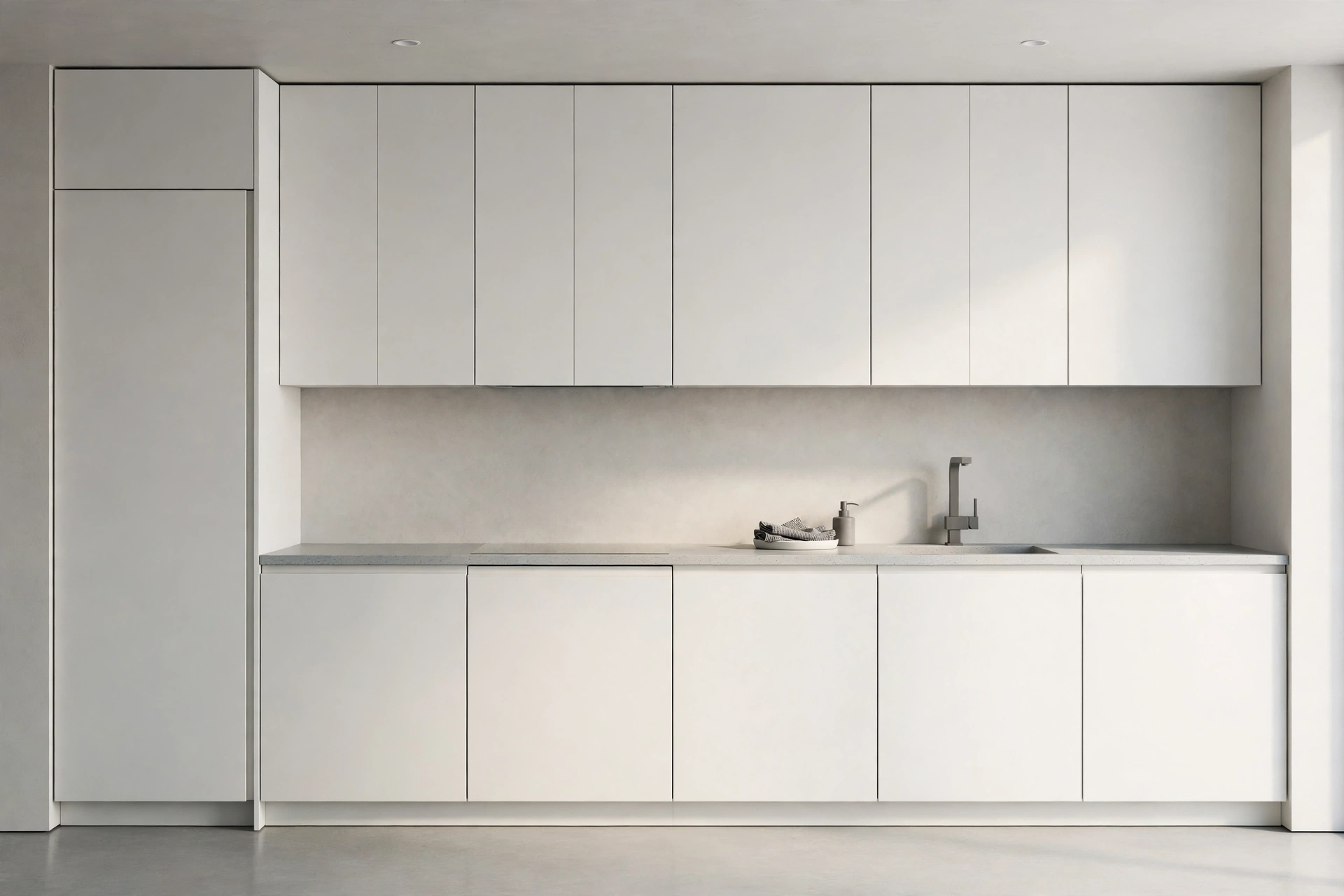
Minimalism does not ban open shelving, but it demands restraint: one shelf, not five, holding a few matching pieces with generous breathing room. A single 36-inch white shelf beside the range, styled with white bowls only, adds warmth without clutter.
Style the shelf once and then stop, leaving at least half of its length empty so the eye rests. The classic mistake is filling open shelves like a shop display, which turns a minimalist kitchen into a busy one overnight.
6. Large-Format Matte Gray Backsplash Tile
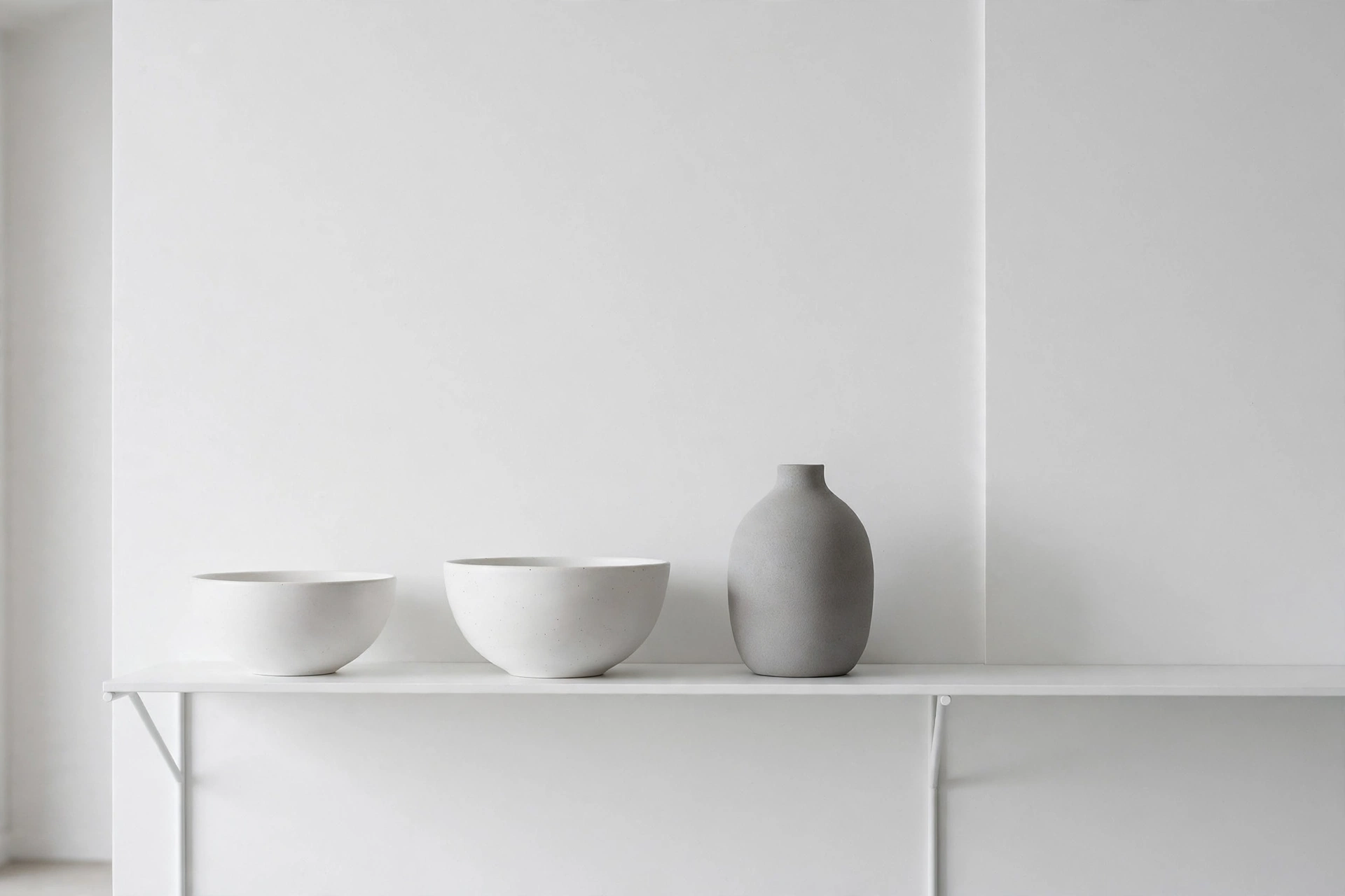
Large-format matte gray backsplash tile, in 12-by-24-inch pieces, keeps grout lines to a minimum and the wall feeling calm. Lay the tiles in a stacked pattern rather than brick bond, since stacked joints reinforce the clean grid of a minimalist design.
Match the grout colour to the tile within one shade, so joints nearly disappear instead of drawing a grid across the wall. Avoid glossy small subway tiles here, because their busy grout pattern competes with the flat-panel cabinets.
7. Under-Cabinet LED Lighting for a Soft Evening Glow
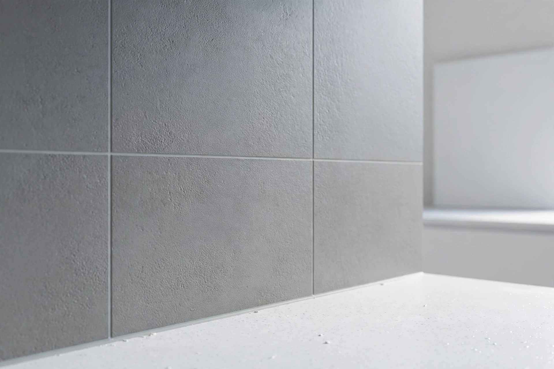
Under-cabinet LED strips turn a white-and-gray kitchen into a warm, glowing room after dark, washing the backsplash in even light. Choose 3000K warm-white LEDs mounted toward the front edge of the cabinet, so the light falls on the work surface, not the wall.
Put the strips on a dimmer, because full brightness at night feels clinical in a minimalist space. A frequent error is leaving a dark gap at the end of a run, so measure the full cabinet length and order continuous strips, not short segments.
8. A Gray Island Base Against a White Countertop
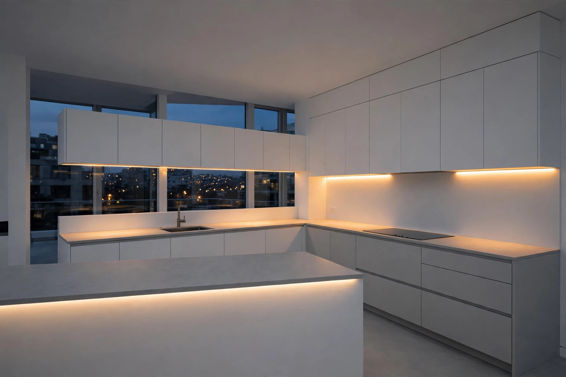
Painting the island base gray while keeping its top white creates a deliberate two-tone anchor that grounds the whole room. The contrast works best when the island gray matches the lower cabinets exactly, tying the two elements into one composition.
Keep the island overhang at twelve inches for comfortable knee room at bar stools, and no deeper, or the slab looks heavy. Avoid adding a second accent colour on the island, since a third colour breaks the disciplined white-and-gray palette.
9. A Simple White Sink and Single-Lever Faucet
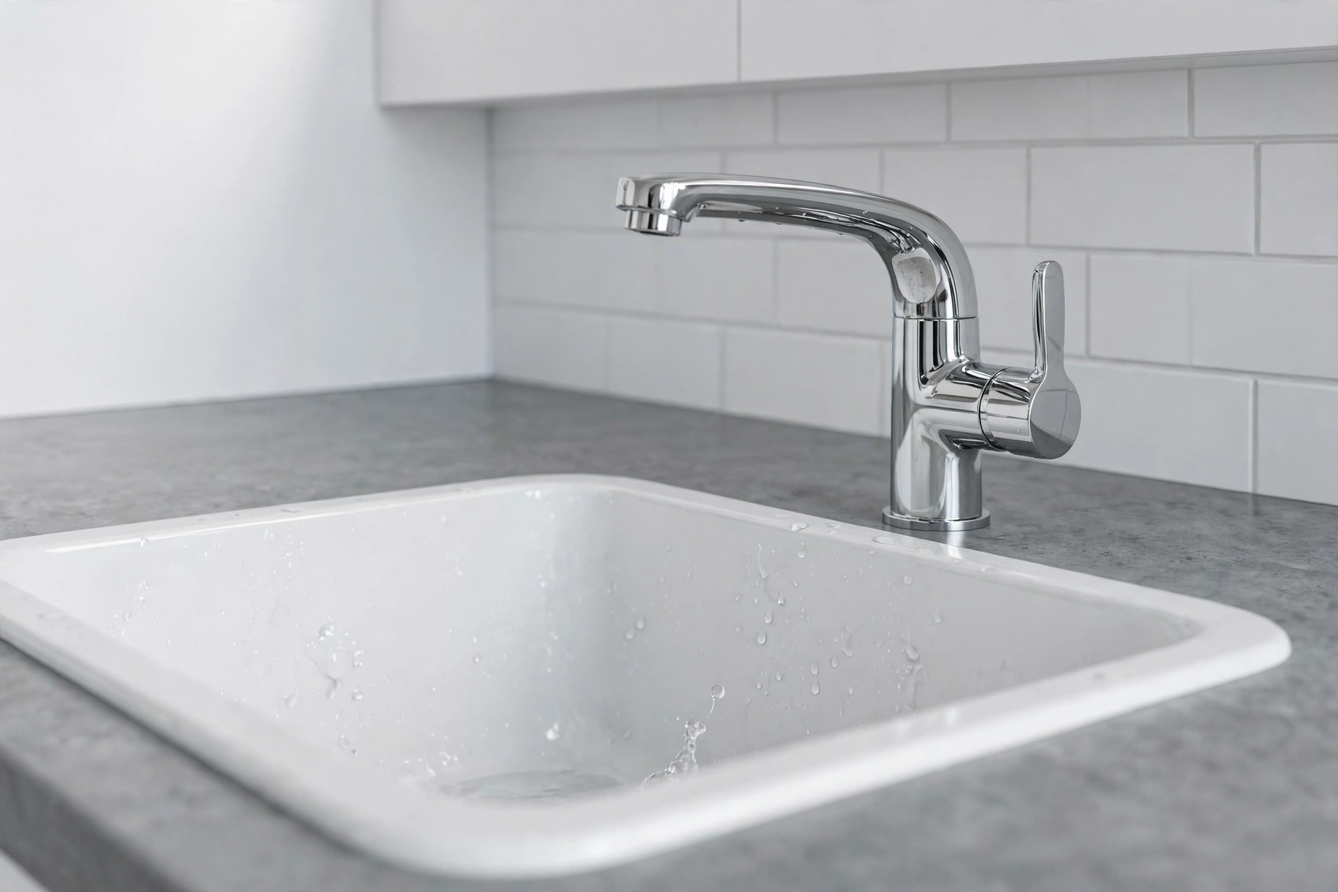
A white undermount sink blends into a white quartz countertop so completely that the washing zone almost disappears. Pair it with a single-lever faucet in brushed chrome, with a slim cylindrical spout, and skip bridge faucets and side sprays entirely.
Choose a sink at least 30 inches wide for a main kitchen, since smaller sinks splash badly with large pots. Never mount the faucet too close to the backsplash, or the lever will hit the wall when turned to hot.
10. Hidden Storage That Keeps Counters Clear
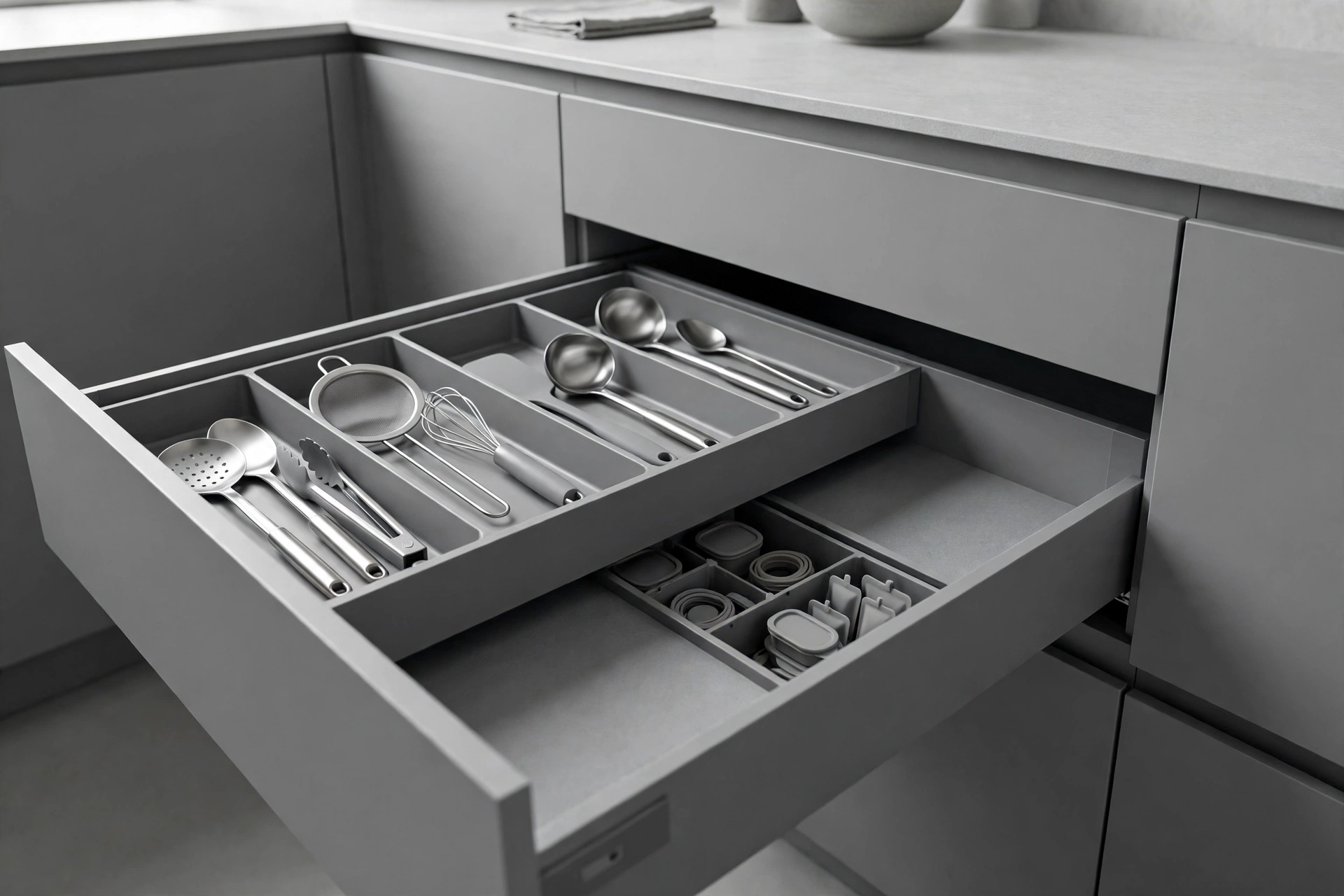
True minimalism is storage, not willpower: deep drawers, toe-kick drawers, and pull-out larders hide everything behind flat fronts. A 36-inch-wide deep drawer beside the range holds pots in two stacked layers, replacing a whole wall of upper cabinets.
Plan one full-height pull-out larder, at least twelve inches wide, for oils and dry goods near the cooking zone. The mistake most remodels make is adding open display space instead of closed storage, which guarantees visible clutter within weeks.
11. Balancing White Uppers with Gray Lowers
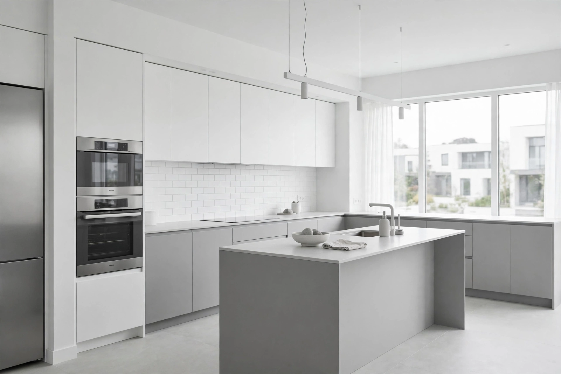
The classic white-and-gray balance puts white above and gray below, because light colours lift the ceiling while darker bases ground the room. Keep the split at countertop height, a clean horizontal line that runs unbroken around the entire kitchen.
Test paint samples on both a sunny wall and a shaded one before committing, since gray shifts dramatically with light direction. Avoid a gray so dark it reads as charcoal, which pushes the room toward a dark-kitchen look rather than a bright minimalist one.
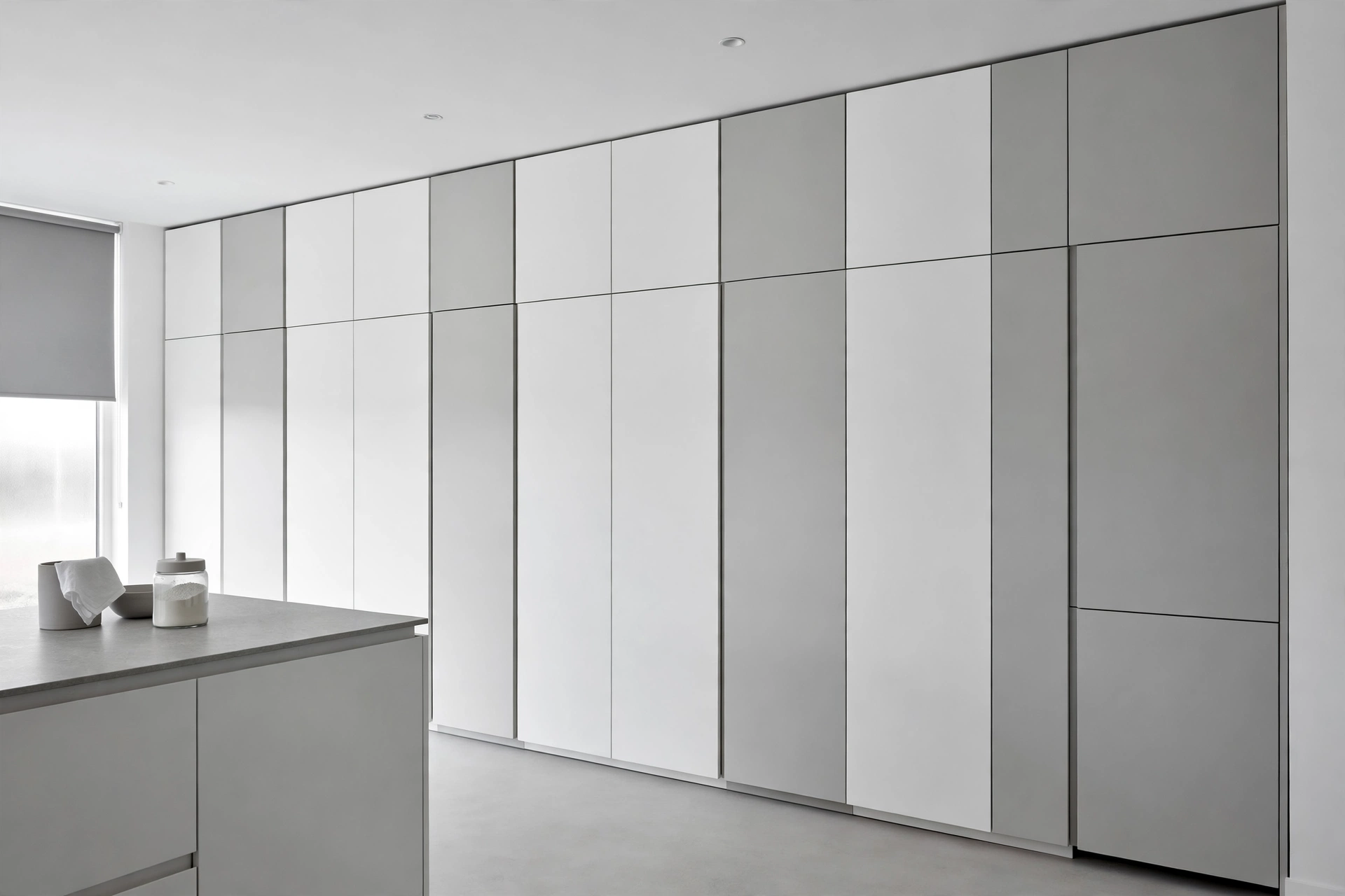
12. A Floor-to-Ceiling Slab-Front Pantry Wall
A floor-to-ceiling pantry wall of slab-front doors turns an entire wall into quiet architecture, hiding food, appliances, and cleaning supplies. Build the wall in white lacquer with vertical reveals of just three millimetres between doors for a tailored, furniture-like finish.
Include one shallow appliance garage behind a lift-up door, about 24 inches wide, for the toaster and coffee maker. Without that garage, small appliances migrate to the countertop and undo the whole minimalist effect within a month.
13. One Small Natural Accent Without Breaking the Palette
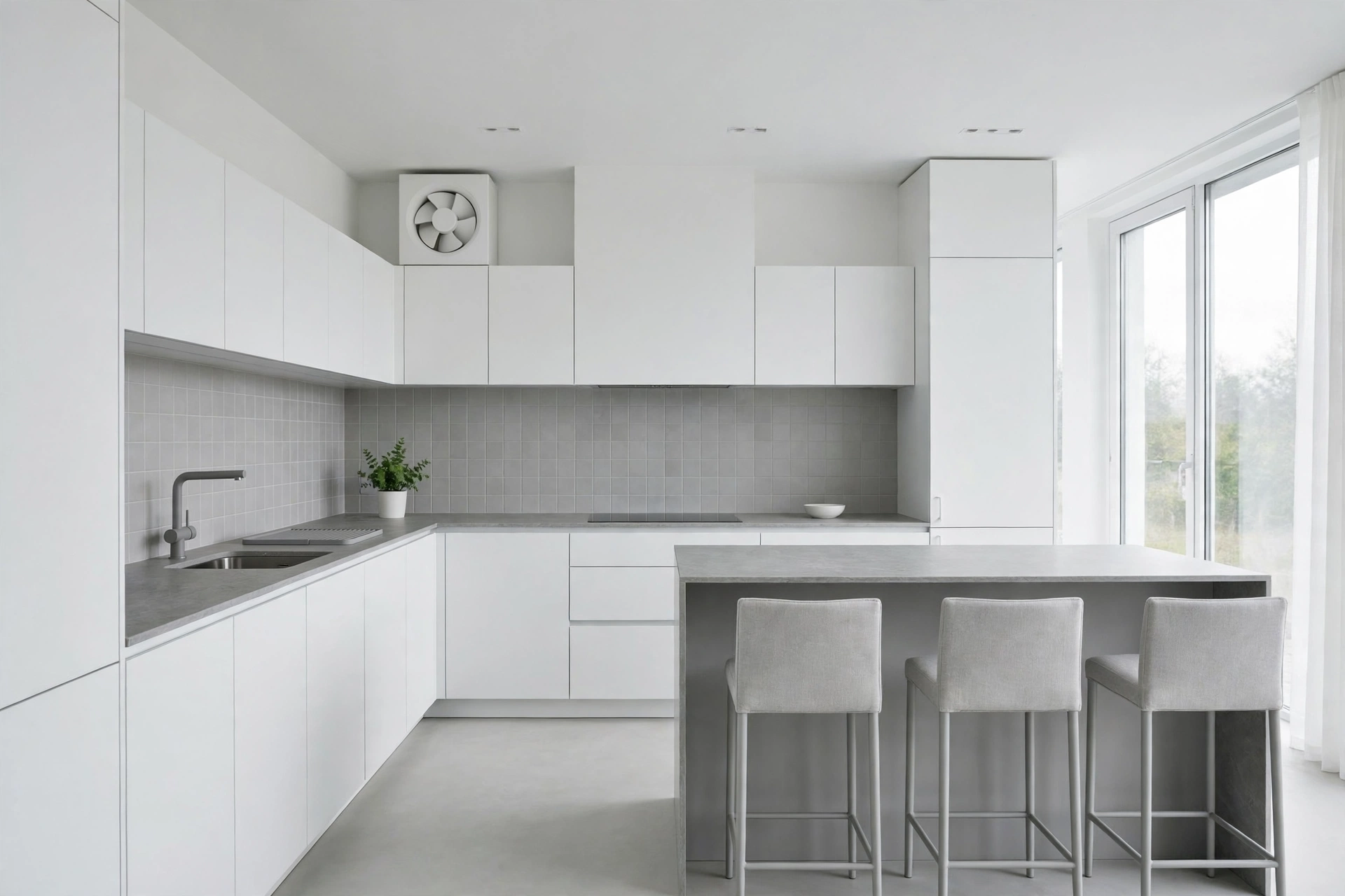
A minimalist palette can still welcome one small natural accent, such as a single potted herb or a linen stool cushion, without losing its calm. Keep the accent to one material and one spot in the room, so it reads as a deliberate pause rather than a new colour scheme.
If you discover you want more timber in the room than a single accent, that is a different kitchen altogether, and a Modern Kitchen Remodel with Warm Wood Cabinets shows how to build the whole design around warm wood instead. Here, restraint is the point, so one accent is always enough.
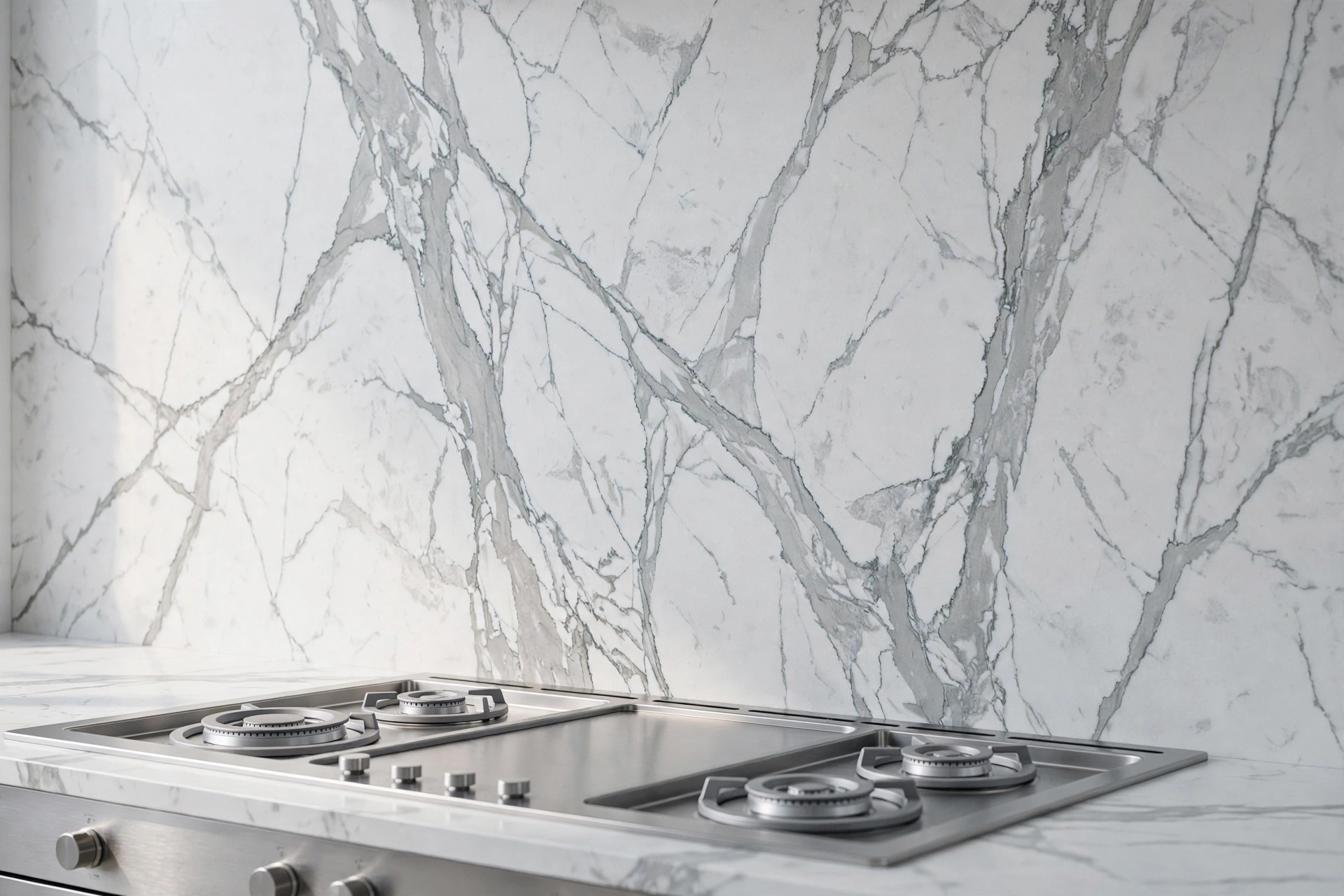
14. A Full-Height Gray-Veined Quartz Slab Backsplash
Running a single quartz slab from countertop to upper cabinets removes every grout line from the cooking wall, creating one continuous surface. Book-match the slab at the range wall if the budget allows, so the veining mirrors itself like an open book.
Choose a slab with soft gray veining on a white ground, and reject slabs with gold or brown veins that would warm the palette. The costly mistake is ordering the slab after cabinets are set, so template the backsplash before the countertop is even cut.
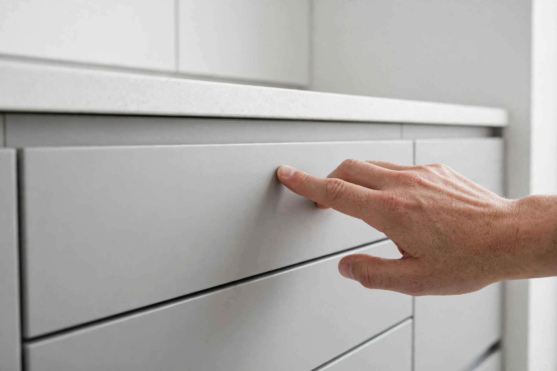
15. Push-to-Open Drawers for Truly Flat Fronts
Push-to-open drawer hardware removes even the recessed finger pull, leaving slab fronts with literally nothing to interrupt them. The mechanism needs a firm press of about two pounds of force, so drawers never pop open when brushed in passing.
Specify soft-close runners rated for at least 75 pounds per drawer, since minimalist kitchens concentrate heavy items in fewer, deeper drawers. Avoid cheap push mechanisms on wide drawers over 30 inches, where they can bind on one side and stick.
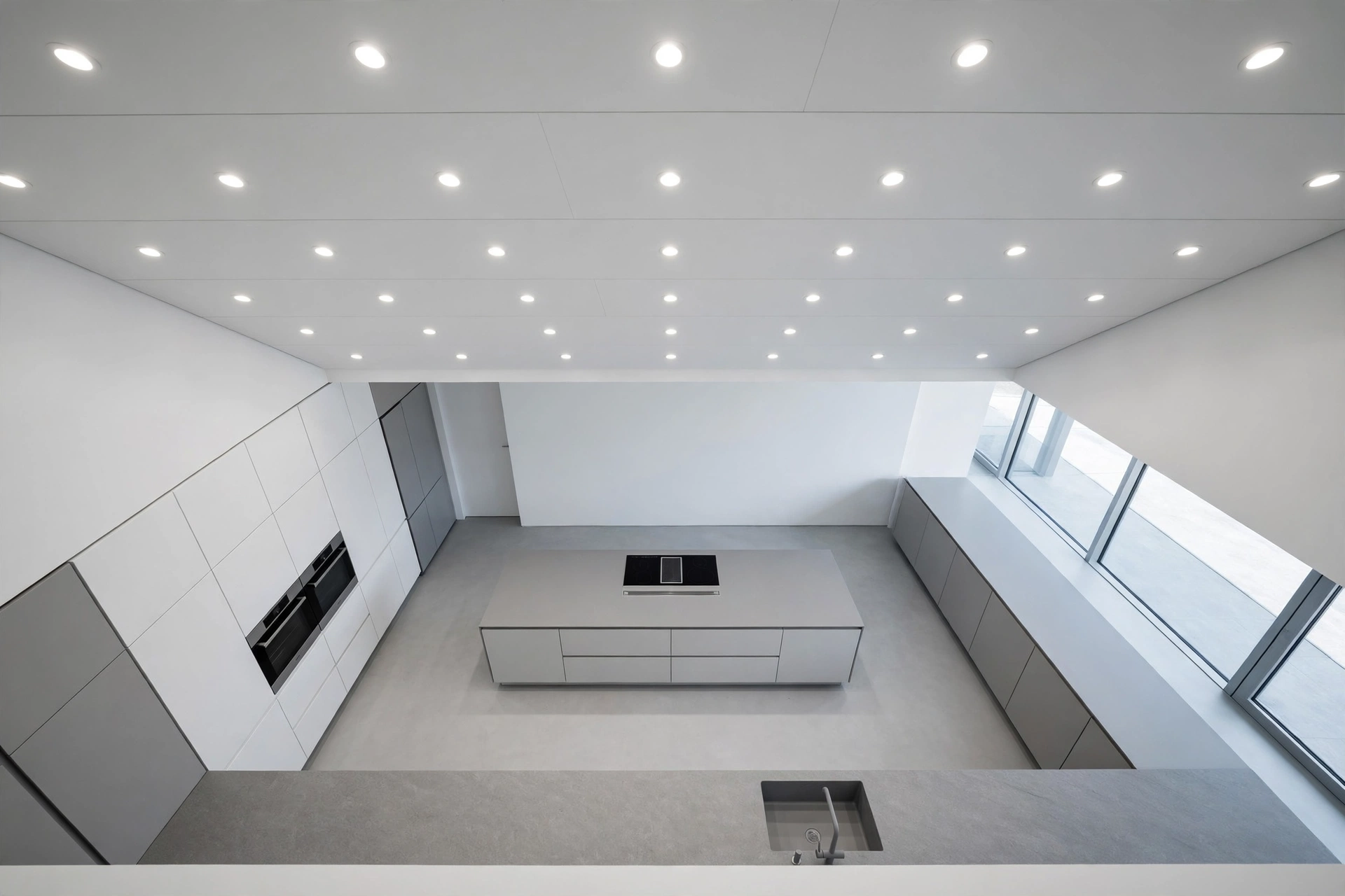
16. A White Ceiling with a Recessed Lighting Grid
The ceiling is the fifth wall of a minimalist kitchen, and a flat white ceiling with recessed lights keeps it as quiet as the cabinets. Space four-inch recessed fixtures about four feet apart in a regular grid, aligned with the island and work zones below.
Use dimmable 3000K recessed lights throughout, and never mix colour temperatures between the ceiling grid and the under-cabinet strips. A common error is placing a decorative pendant over every zone, which reintroduces exactly the visual noise minimalism removes.
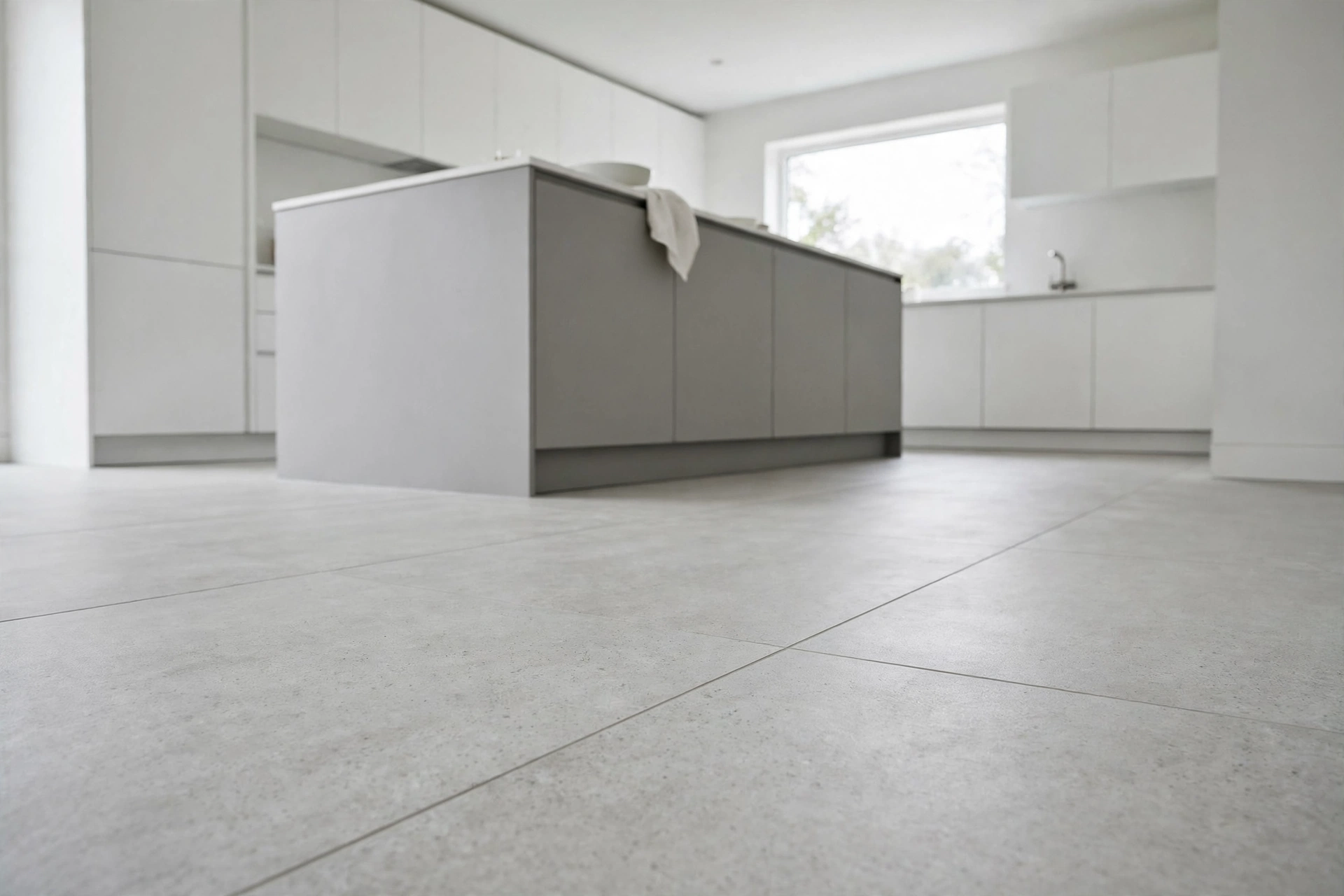
17. Large Light Gray Porcelain Floor Tiles
Large light gray porcelain tiles, 24 by 24 inches or larger, make the floor read as one calm plane beneath the white cabinets. Their matte finish hides dust and footprints far better than polished tile, which matters in a kitchen designed to look clean.
Match the grout to the tile colour and keep joints to one-sixteenth of an inch with rectified edges. Never choose a busy patterned floor tile here, since the floor is meant to disappear, not to compete with the island.
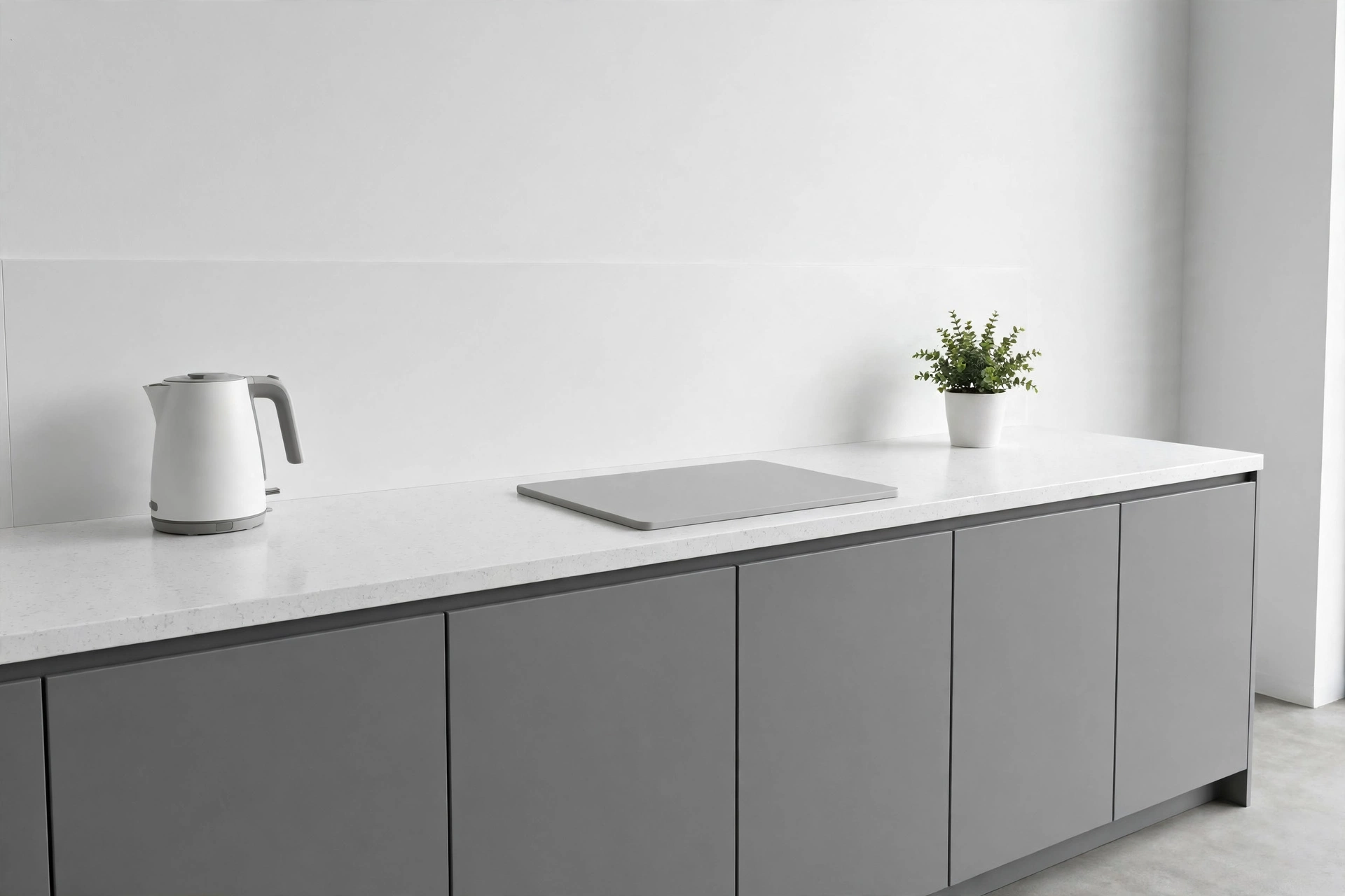
18. The Three-Item Countertop Rule
A minimalist countertop follows a simple rule: no more than three items may live on it permanently, such as a kettle, a board, and a small plant. Everything else earns its place in a drawer or larder, which is why the hidden storage planned earlier matters so much.
Audit the countertop weekly for the first month after the remodel, returning drifted items to their homes before clutter becomes habit. The mistake is treating the rule as decoration advice, when it is actually a storage-planning requirement.
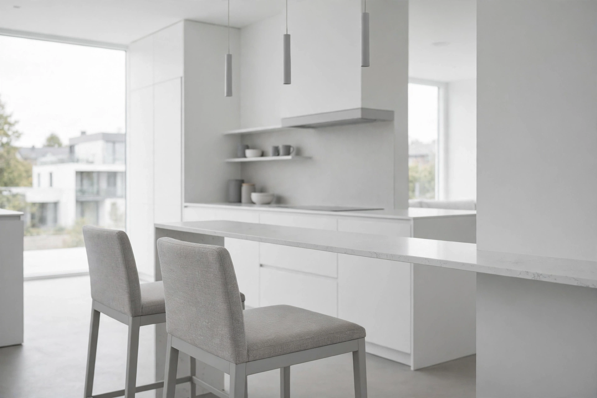
19. A Slim Breakfast Bar in White Quartz
A slim breakfast bar, just 24 inches deep in white quartz, gives a minimalist kitchen a casual eating spot without a bulky table. Cantilever the slab from the island end with hidden steel brackets rated for 200 pounds, so no legs interrupt the clean lines.
Allow 24 inches of width per stool and keep stools backless, in light gray, so they tuck fully beneath the overhang. Backed bar chairs that stick out into the walkway are a common error, since they block the circulation the minimalist layout is meant to protect.
20. A Modern Minimalist Kitchen Remodel with White and Gray for Small Spaces
Small kitchens benefit most from this palette, because white uppers and pale gray floors visually double a compact room. In a galley under ten feet long, run cabinets on one wall only and use a slim 30-inch island, keeping a clear 42-inch aisle.
Skip the double oven and full-size pantry in a small remodel, choosing a 24-inch combination oven and a pull-out larder instead. The error to avoid is shrinking the palette rather than the footprint, since a dark small kitchen feels half its real size.
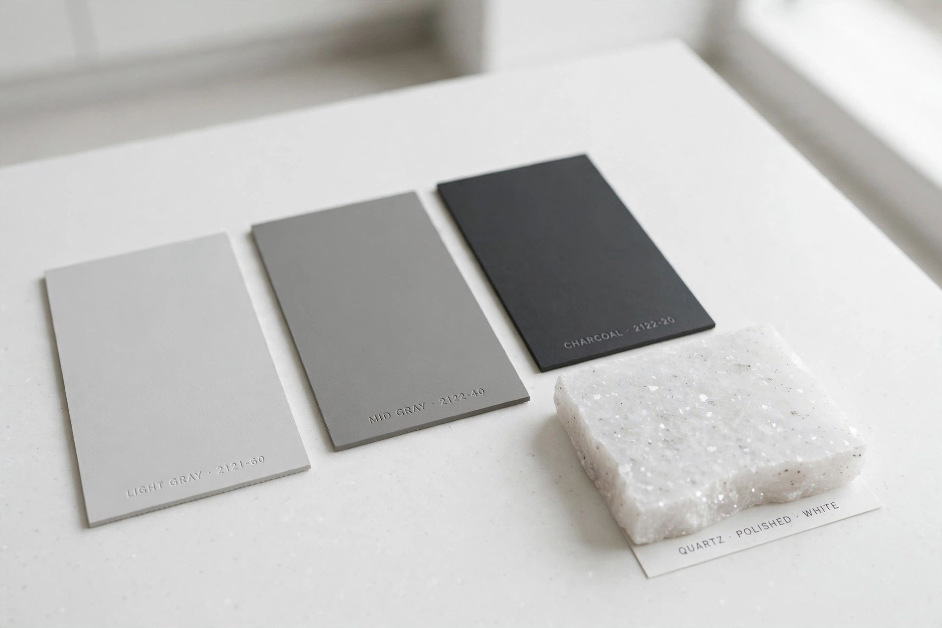
21. The Three-Grays Rule for a Cohesive Palette
Limit the whole kitchen to three grays at most: one light, one mid-tone, and one darker accent for the island or a single wall. Write the three paint codes on one card and hand it to every tradesperson, so touch-ups and new pieces never introduce a fourth gray.
Test the three grays together on one board under both daylight and evening LED light before ordering cabinets. A frequent mistake is choosing grays from separate paint ranges, where undertones clash and the room feels unintentionally patchy.
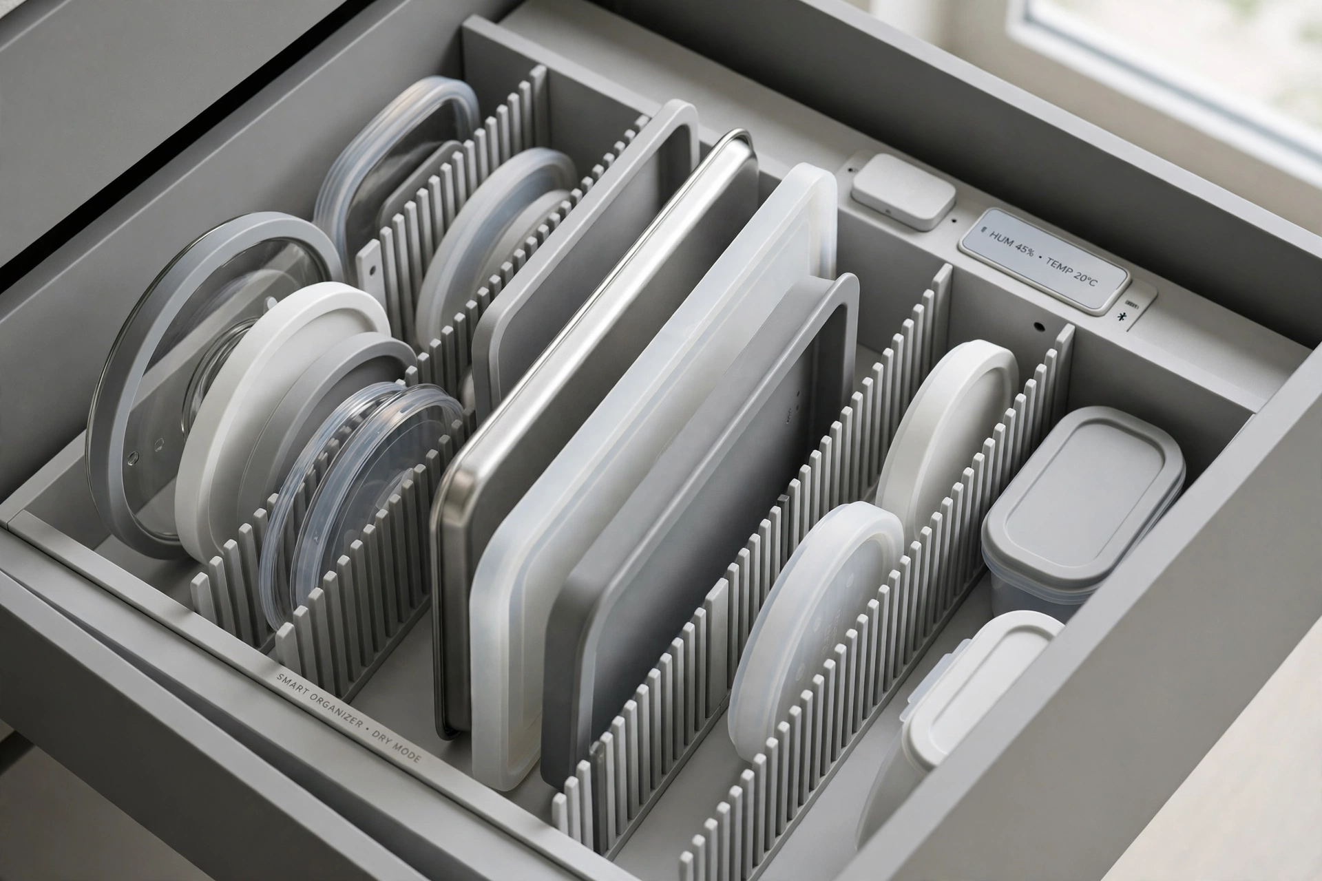
22. Smart Drawer Organizers and Vertical Dividers
Minimalism survives daily use only when every drawer has a fixed home for its contents, so fit dividers before moving anything back in. Vertical dividers spaced two inches apart keep trays, lids, and boards upright in one deep drawer near the range.
Measure the largest pan and board first, then buy dividers to fit, rather than buying organizers and hoping contents follow. The mistake is organising by category alone, which fails when one oversized item has no slot and ends up on the counter.
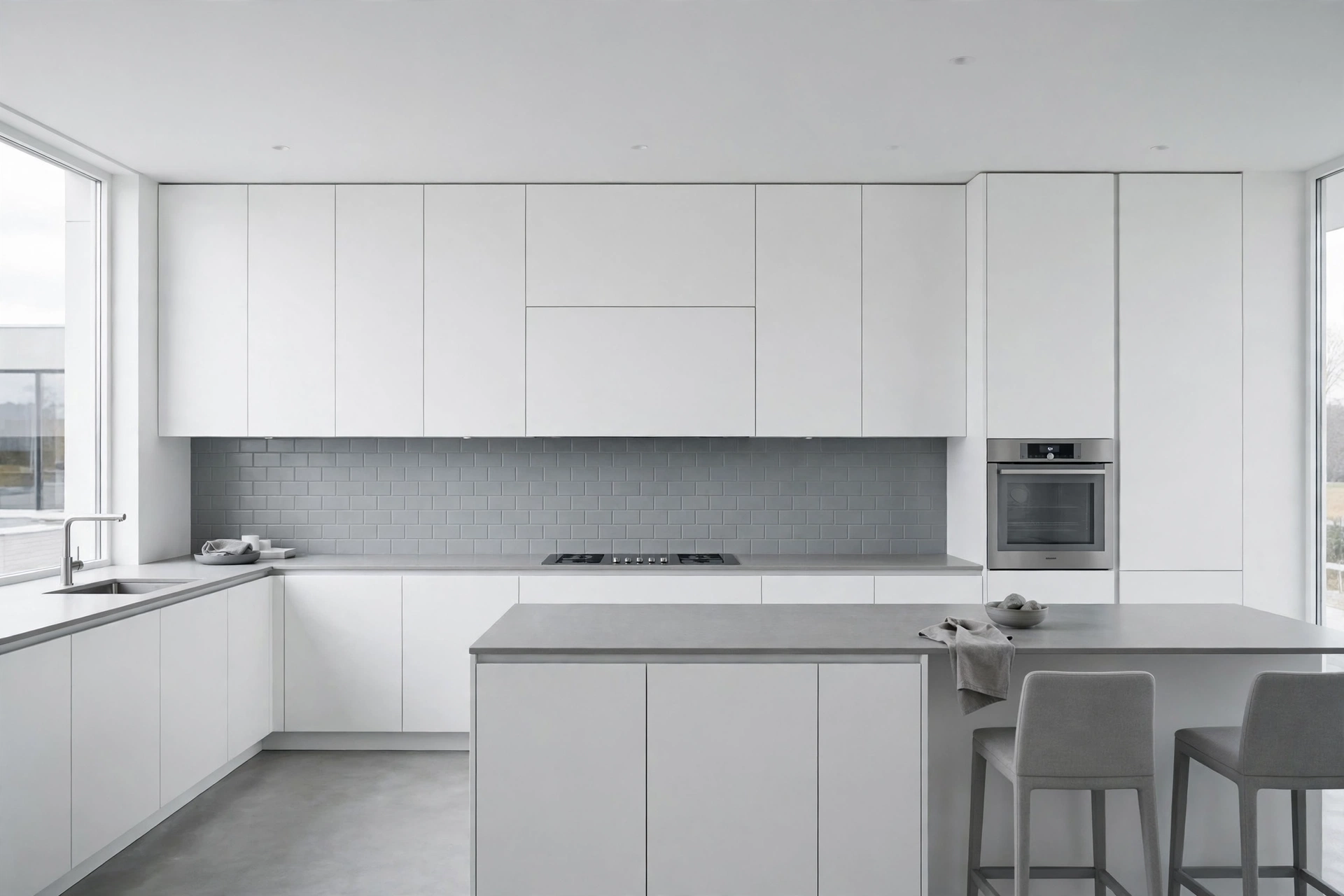
23. A Concealed Flush Range Hood
A concealed range hood, built into the upper cabinets with a flush white panel, removes the last bulky appliance silhouette from the cooking wall. Choose a model extracting at least 600 cubic feet per minute for a 36-inch range, ducted outside wherever possible.
Mount the hood panel exactly flush with neighbouring cabinet fronts, using adjustable brackets to correct any cabinet unevenness. A proud or recessed hood panel catches light differently and betrays the concealment, so check the alignment from an angle, not just head-on.
24. Sheer Window Treatments That Maximise Daylight
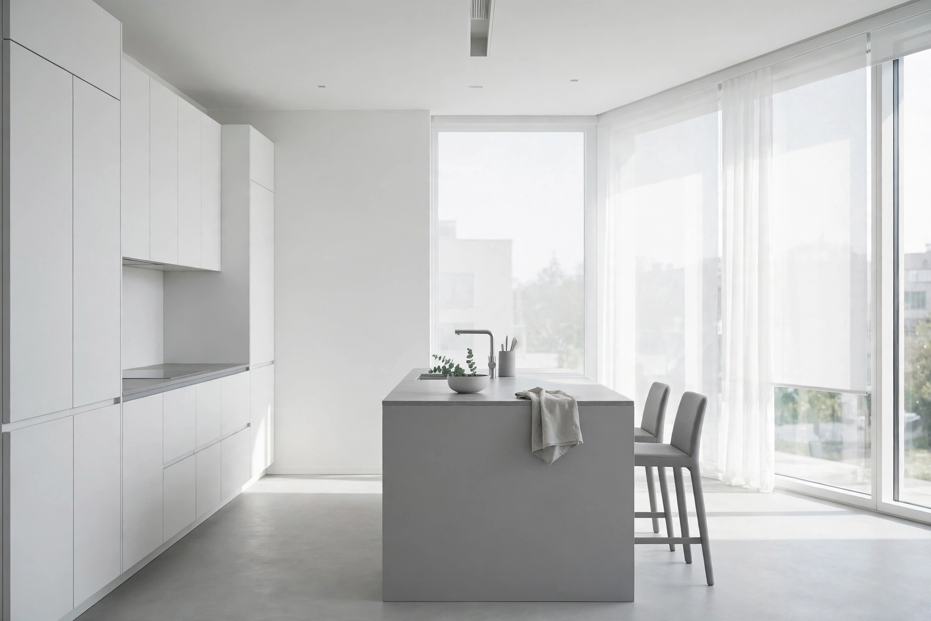
Daylight is the best decoration in a white-and-gray kitchen, so dress windows in sheer white roller blinds that filter glare without blocking light. Mount the blind inside the reveal, keeping the window frame and sill in clean white to match the cabinets.
Skip heavy curtains and patterned valances entirely, since fabric bulk contradicts the flat, hard surfaces of the remodel. The common error is choosing a gray blind that darkens the window wall, when the goal is to keep the brightest wall in the room bright.
25. Finishing Touches for a Modern Minimalist Kitchen Remodel with White and Gray
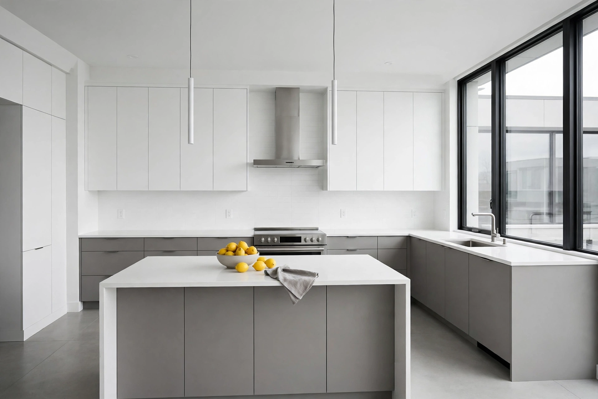
The finishing touches are deliberately few: a bowl of lemons on the island, matching gray stools, and one small plant by the window. Walk the finished kitchen at dusk with the LEDs on, and remove anything that draws the eye away from the room itself.
These modern minimalist kitchen remodel with white and gray ideas work best when planned as one disciplined system, from flat-panel cabinets to hidden storage to the three-item countertop. With restraint and careful measurements, your kitchen will stay bright, calm, and timeless for years.
2 Comments